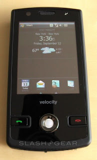
With the current economic climate and the hotly contested smartphone war, it's either a great time or a ridiculous time to be launching a new cellphone. Velocity Mobile as a company are not that green - in fact Phone Magazine played with their handsets earlier this year - but they've only just got around to commercially launching their first device, the 103. With a VGA touchscreen, 3G HSUPA, WiFi, GPS and, as is the fashion these days, a custom GUI sitting on top of Windows Mobile 6.1 Pro, we've been putting the 103 through its paces over the past few weeks.
The spec sheet reads well, which is always a good start. As well as quadband GSM and triband UMTS/HSDPA/HSUPA (850/1900/2100), there’s WiFi b/g, Bluetooth 2.0 and GPS. A two-megapixel camera lurks around the back, with a front VGA camera for video-calls. Primary input is via the 2.8-inch 640 x 480 VGA resistive touchscreen, but there’s also a trackball (with click-select) and call/end buttons on the front panel. On the left-hand side there’s a camera shortcut, volume control and shortcut to the Odyssey GUI, while on the right there’s a microSD slot that you have to take off the battery cover to access.
On the base of the 103 is a mini-USB port for charging and tethering the smartphone, together with a 2.5mm headphone jack that doubles as an A/V output, and the stylus. Two styli are supplied in the box, as well as the A/V cable, a USB cable, wired headset, soft case, AC adapter, manuals and a software CD. The 103 measures a chunky 4.4 x 2.2 x 0.5-inches and weighs 4.5oz.
Switch on, and the first thing to impress is the quality of the screen. 2.8-inches isn’t huge compared to some devices on the market, but VGA resolution, even at that size, and 262,000 colors makes for a vibrant display. It’s a shame, then, that the default Odyssey color scheme is black, black and more black; yes, it’s unlikely to upset anyone, but it also fails miserably at showing off what’s arguable the 103’s best feature. Odyssey, like HTC’s TouchFLO 3D or Samsung’s TouchWiz, is intended to make Windows Mobile more user-friendly. It primarily consists of a two-stage app launcher, summoned either by swiping a finger up the screen or by tapping the shortcut key on the side, firstly in the form of a four-icon bar along the bottom and then a full 4 x 4 icon grid. The usual Start menu and status bar remains along the top of the display


No comments:
Post a Comment